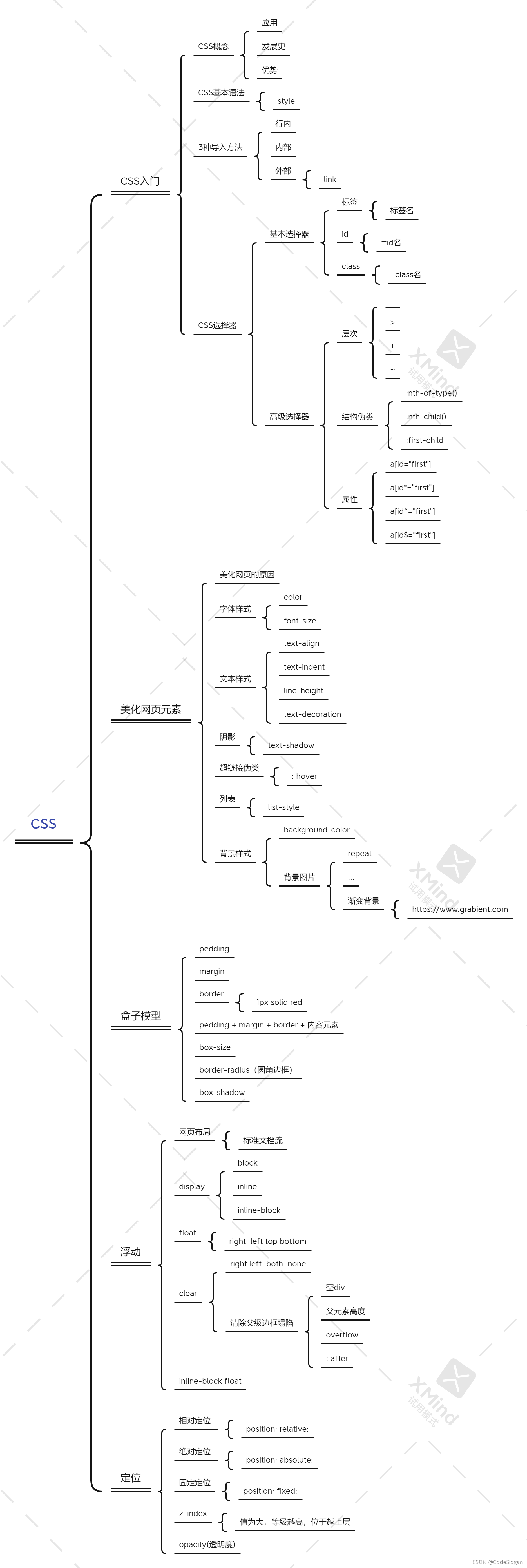
知识框架图
1. CSS
- CSS 指的是层叠样式表 (Cascading Style Sheets)
- CSS 描述了如何在屏幕、纸张或其他媒体上显示 HTML 元素
- CSS 节省了大量工作,它可以同时控制多张网页的布局
- 外部样式表存储在 CSS 文件中
层叠(级联)样式表。
2. CSS3种导入方法
行内
1
| <h1 style="color: aqua">一级标题</h1>
|
内部
1
2
3
4
5
| <style>
h1{
color:red;
}
</style>
|
位置html文件的head标签内
外部
1
| <link rel="stylesheet" href="css/style.css">
|
通过以上链接的方面,同时运行html和css文件
3. 选择器
3.1 *三种基本选择器
标签选择器
1
2
3
4
5
6
7
8
9
10
11
12
13
14
15
16
17
18
19
20
21
22
23
24
| <!DOCTYPE html>
<html lang="en">
<head>
<meta charset="UTF-8">
<title>标签选择器</title>
<style>
h1{
color: rgba(16, 94, 160, 0.27);
}
p{
font-size: xxx-large;
}
</style>
</head>
<body>
<h1>JavaWeb</h1>
<h1>CSS</h1>
<p>during learning of CSS</p>
</body>
</html>
|
直接以标签作为style里的名称
类选择器
1
2
3
4
5
6
7
8
9
10
11
12
13
14
15
16
17
18
19
20
21
22
23
24
25
| <!DOCTYPE html>
<html lang="en">
<head>
<meta charset="UTF-8">
<title>类选择器</title>
<style>
.title{
color: #e05673;
}
.code{
font-size: 3px;
}
</style>
</head>
<body>
<h1 class="title">JavaWeb</h1>
<h1 class="code">CSS</h1>
<p class="title">during learning of CSS</p>
</body>
</html>
|
- 以
.类名的形式使用选择器
- 可在不同标签中复用,呈现相同的样式
- 较常见
id选择器
1
2
3
4
5
6
7
8
9
10
11
12
13
14
15
16
17
18
19
20
21
22
23
24
25
| <!DOCTYPE html>
<html lang="en">
<head>
<meta charset="UTF-8">
<title>id选择器</title>
<style>
#buttons-hbox{
color: aquamarine;
}
#buttons{
color: chartreuse;
}
</style>
</head>
<body>
<h1 id="buttons-hbox">JavaWeb</h1>
<h1 id="buttons">CSS</h1>
<p>during learning of CSS</p>
</body>
</html>
|
3.2 层次选择器
后代选择器
1
2
3
| body p{
color: #e05673;
}
|
对body往后所有p结点均生效
子选择器
1
2
3
4
|
body>p{
color: chartreuse;
}
|
>只对下一代的p有效
下兄弟选择器
1
2
3
| .active + p{
color: aquamarine;
}
|
只对当前位置下一位有效,不包括现标签
通用选择器
1
2
3
| .active~p{
color: blueviolet;
}
|
对当前位置以下所有对应标签有效,不包括当前
3.3 结构伪类选择器
1
2
3
4
|
p:nth-child(2){
color: red;
}
|
定位到父元素,选择第二个子元素,若为p标签才修改颜色
1
2
3
4
|
p:nth-of-type(2){
color: blue;
}
|
定位到父元素 第二个p标签,以标签类型顺序
1
2
3
4
|
ul li:first-child {
background: #e05673;
}
|
第一个孩子
1
2
3
4
|
ul li:last-child{
background: yellow;
}
|
最后一个孩子
1
2
3
4
|
a:hover {
background: aqua;
}
|
3.4 属性选择器
基础语法
| 符号 |
含义 |
| = |
绝对等于 |
| *= |
模糊等于 |
| ^= |
以此开关 |
| $= |
以此结尾 |
body
1
2
3
4
5
6
7
8
9
10
11
12
| <p class="demo">
<a href="https://www.baidu.com" class="links item first" id="first">1</a>
<a href="" class="links item active" target="_blank" title="test">2</a>
<a href="image/123.html" class="links item">3</a>
<a href="image/123.png" class="links item">4</a>
<a href="image/123.jpg" class="links item">5</a>
<a href="abc" class="links item">6</a>
<a href="/a.pdf" class="links item">7</a>
<a href="/abc.pdf" class="links item">8</a>
<a href="abc.doc" class="links item">9</a>
<a href="abcd.doc" class="links item last">10</a>
</p>
|
基础style
1
2
3
4
5
6
7
8
9
10
11
12
13
| .demo a{
float: left;
display: block;
height: 50px;
width: 50px;
border-radius: 10px;
background: #2700ff;
text-align: center;
color: gainsboro;
text-decoration: none;
margin-right: 5px;
font: bold 20px/50px Arial;
}
|
设置demo类下所有的标签

属性选择
1
2
3
4
|
a[id]{
background: yellow;
}
|
绝对等于
1
2
3
4
|
a[id="first"]{
background: yellow;
}
|
模糊等于
1
2
3
4
|
a[class*="links"]{
background: greenyellow;
}
|
以开头
1
2
3
4
|
a[href^="image"]{
background: rebeccapurple;
}
|
以结尾
1
2
3
4
|
a[href$="doc"]{
background: aqua;
}
|
4. 美化网页元素
4.1 为什么要美化网页
- 有效传递页面的信息
- 美化网页,页面漂亮,才能吸引用户
- 突显用户页面的主题
- 提高用户的体验
4.2 字体样式
span关键字
1
2
3
4
5
6
7
8
9
10
11
12
13
14
15
16
17
18
19
20
21
22
| <!DOCTYPE html>
<html lang="en">
<head>
<meta charset="UTF-8">
<title>Title</title>
<style>
span{
font-size: xx-large;
}
</style>
</head>
<body>
<p>
<span>Java</span>学习中
</p>
</body>
</html>
|

字体
1
2
3
4
5
6
7
8
9
10
11
12
13
14
15
| <style>
body{
font-family: 仿宋_GB2312;
font-size: x-large;
font-weight: bolder;
color: gainsboro;
background: black;
}
h1{
font-size: xxx-large;
}
.title{
font-weight: inherit;
}
</style>
|
4.3 文本样式
颜色
color rgb rgba
1
2
3
| h1{
color: rgba(0, 255,255,0.9);
}
|
对齐方式
1
2
3
| h1{
text-align: center;
}
|
首行缩进
1
2
3
| .p1{
text-indent: 2em;
}
|
行高
line-height = height
1
2
3
4
5
| .p3{
background: purple;
height: 50px;
line-height: 50px;
}
|
行高与块的高度一致时,可以实现上下居中
装饰
1
2
3
4
5
6
7
8
9
10
11
12
13
|
.l1{
text-decoration: underline;
}
.l2{
text-decoration: line-through;
}
.l3{
text-decoration: overline;
}
|
4.4 阴影
1
2
3
4
|
#price{
text-shadow: #e05673 2px 5px 5px;
}
|
4.5 超链接伪类
a:hover 重点记忆使用
1
2
3
4
5
6
7
8
9
|
a:hover{
color: aqua;
font-size: xxx-large;
}
a:active{
color: greenyellow;
}
|
4.6 列表
1
2
3
4
5
6
7
8
9
10
11
12
| <div id="nav">
<h2 class="title">全部商品分类</h2>
<ul>
<li><a href="#">图书</a></li>
<li><a href="#">家用电器</a></li>
<li><a href="#">电脑</a></li>
<li><a href="#">家居</a></li>
<li><a href="#">服饰鞋帽</a></li>
<li><a href="#">彩票</a></li>
<li><a href="#">食品饮料</a></li>
</ul>
</div>
|
1
2
3
4
5
| ul li{
list-style: none;
height: 30px;
text-indent: 1em;
}
|
4.7 背景
1
2
|
background: red url("") 270px 10px no-repeat;
|
1
2
3
| background-image: url("");
background-repeat: repeat-x/repeat-y/no-repeat;
background-position: 200px 20px;
|
4.8 渐变
[https://www.grabient.com/]:
圆角边框
1
2
3
4
5
6
| div{
width: 100px;
height: 100px;
border: 10px solid red;
border-radius: 50px;
}
|
border-radius可修改矩阵角,当值为长宽的一半时,可呈现圆形
盒子阴影
1
2
3
4
5
6
|
<div style="width: 800px; display: block; text-align: center">
<div style="margin: 0 auto">
<img src="images/1.bmp" alt="">
</div>
</div>
|
5. 浮动
5.1 display
标准文档流
1
2
3
4
5
6
7
8
9
10
11
12
13
14
15
|
div{
width: 100px;
height: 100px;
border: 1px solid red;
display: inline;
}
span{
width: 100px;
height: 100px;
border: 1px solid red;
display: inline-block;
}
|
5.2 float
5.3 clear
1
2
3
4
5
6
7
| clear: right;
clear:left;
clear: both;
clear: none;
|
5.4 边框塌陷解决方案
1
2
3
4
5
6
7
8
9
10
11
12
13
14
15
16
17
18
19
20
| <!DOCTYPE html>
<html lang="en">
<head>
<meta charset="UTF-8">
<title>Title</title>
<link rel="stylesheet" href="css/style.css">
</head>
<body>
<div id="father">
<div class="layer01"><img src="images/1.bmp" alt=""></div>
<div class="layer02"><img src="images/photo1.jpg" alt=""></div>
<div class="layer03"><img src="images/QQ图片20210419222850.jpg" alt=""></div>
<div class="layer04">
指一个人发出的笑声,高兴开心欢乐时的状态,抒发快乐的心情,表现一个人很开心快乐的状态。也指人通常用来开玩笑。人的一种笑声,表示高兴、开心、愉悦,也表示兴奋。
</div>
</div>
</body>
</html>
|
1
2
3
4
5
6
7
8
9
10
11
12
13
14
15
16
17
18
19
20
21
22
23
24
25
26
27
28
29
30
31
32
33
34
35
36
37
38
39
40
41
42
43
44
45
46
47
48
49
50
| div{
margin: 10px;
padding: 5px;
}
#father{
border: 1px #000 solid;
}
#father:after{
content: '';
display: block;
clear: both;
}
.layer01{
border: 1px #F00 dashed;
display: inline-block;
float: left;
}
.layer02{
border: 1px #00F dashed;
display: inline-block;
float: left;
}
.layer03{
border: 1px #060 dashed;
display: inline-block;
float: right;
}
.layer04{
border: 1px #666 dashed;
font-size: 12px;
line-height: 23px;
display: inline-block;
float: right;
clear: none;
}
|
核心语句
1
2
3
4
5
| #father:after{
content: '';
display: block;
clear: both;
}
|
6. 定位
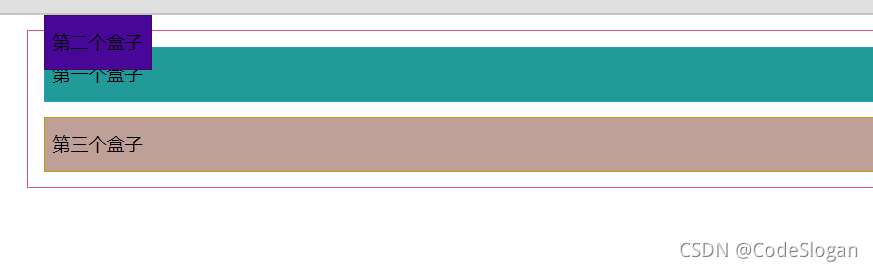
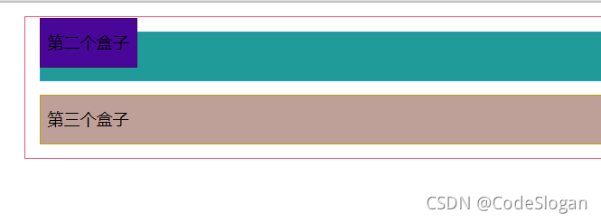
6.1 相对定位
1
2
3
4
5
6
7
8
9
10
11
12
13
14
15
16
17
18
19
20
21
22
23
24
25
26
27
28
29
30
31
32
33
34
35
36
37
38
39
40
41
42
43
44
45
46
47
| <!DOCTYPE html>
<html lang="en">
<head>
<meta charset="UTF-8">
<title>Title</title>
<style>
div{
margin: 10px;
padding: 5px;
font-size: 12px;
line-height: 25px;
}
#father{
border: 1px solid #e05673;
padding: 0;
}
#first{
border: 1px solid #209bcb;
background-color: #209b99;
position: relative;
top: -10px;
}
#second{
border: 1px solid #490761;
background-color: #490799;
position: relative;
left: 10px;
}
#third{
border: 1px solid #bfa008;
background-color: #bfa099;
position: relative;
right: -10px;
}
</style>
</head>
<body>
<div id="father">
<div id="first">第一个盒子</div>
<div id="second">第二个盒子</div>
<div id="third">第三个盒子</div>
</div>
</body>
</html>
|
关键代码
1
2
3
4
5
6
| #third{
border: 1px solid #bfa008;
background-color: #bfa099;
position: relative;
right: -10px;
}
|
position: relative 相对定位,不会超出标准文件流,边框不会被破坏
top 为负时,向上移动
bottom 为负时,向下移动
left 为负时,向左移动
right 为负时,向右移动
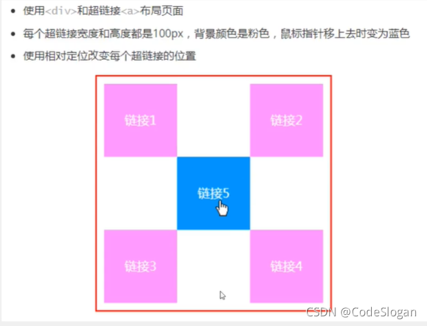
方块定位练习
1
2
3
4
5
6
7
8
9
10
11
12
13
14
15
16
17
18
19
20
21
22
23
24
25
26
27
28
29
30
31
32
33
34
35
36
37
38
39
40
41
42
43
44
45
46
47
48
49
| <!DOCTYPE html>
<html lang="en">
<head>
<meta charset="UTF-8">
<title>Title</title>
<style>
.box{
width: 300px;
height: 300px;
border: 2px solid red;
padding: 10px;
}
a{
text-decoration: none;
background: hotpink;
width: 100px;
height: 100px;
line-height: 100px;
text-align: center;
display: block;
}
a:hover{
background-color: dodgerblue;
}
.second, .four{
position: relative;
right: -200px;
top: -100px;
}
.five{
position: relative;
right: -100px;
top: -300px;
}
</style>
</head>
<body>
<div class="box">
<a href="" class="first">链接1</a>
<a href="" class="second">链接2</a>
<a href="" class="third">链接3</a>
<a href="" class="four">链接4</a>
<a href="" class="five">链接5</a>
</div>
</body>
</html>
|
6.2 绝对定位
- 不会保留原来的位置
- 没有父级元素的前提下,根据浏览器定位
- 有父级元素的限制下,参照父级元素定位
- 在父级元素的范围内移动
总结:相对于父级及浏览器的位置,进行指定的偏移,它不在标准文档流中,原来的位置不会被保留
1
2
3
4
5
6
7
8
9
10
11
12
13
14
15
16
17
18
19
20
21
22
23
24
25
26
27
28
29
30
31
32
33
34
35
36
37
38
39
40
41
42
43
44
| <!DOCTYPE html>
<html lang="en">
<head>
<meta charset="UTF-8">
<title>Title</title>
<style>
div{
margin: 10px;
padding: 5px;
font-size: 12px;
line-height: 25px;
}
#father{
border: 1px solid #e05673;
padding: 0;
position: relative;
}
#first{
border: 1px solid #209bcb;
background-color: #209b99;
}
#second{
border: 1px solid #490761;
background-color: #490799;
position: absolute;
top: -10px;
}
#third{
border: 1px solid #bfa008;
background-color: #bfa099;
}
</style>
</head>
<body>
<div id="father">
<div id="first">第一个盒子</div>
<div id="second">第二个盒子</div>
<div id="third">第三个盒子</div>
</div>
</body>
</html>
|
无父级元素
存在父级元素
6.3 固定定位
1
2
3
4
5
6
7
8
9
10
11
12
13
14
15
16
17
18
19
20
21
22
23
24
25
26
27
28
29
30
31
32
33
34
| <!DOCTYPE html>
<html lang="en">
<head>
<meta charset="UTF-8">
<title>Title</title>
<style>
body{
height: 1000px;
}
div:nth-of-type(1){
width: 100px;
height: 100px;
background-color: red;
position: absolute;
right: 0;
bottom: 0;
}
div:nth-of-type(2){
width: 50px;
height: 50px;
background-color: yellow;
position: fixed;
right: 0;
bottom: 0;
}
</style>
</head>
<body>
<div>div1</div>
<div>div2</div>
</body>
</html>
|
position: fixed;固定位置,不会随着浏览器的滑动而发生改变
6.4 z-index
z-index决定图层的显示级别
opacity: 0.5;透明度
1
2
3
4
5
6
7
8
9
10
11
12
13
14
15
16
17
18
19
20
21
22
| <!DOCTYPE html>
<html lang="en">
<head>
<meta charset="UTF-8">
<title>zindex</title>
<link rel="stylesheet" href="css/style.css">
</head>
<body>
<div id="content">
<ul>
<li><img src="images/img.png" alt=""></li>
<li class="tipText">JDBC</li>
<li class="tipBg"></li>
<li>2021-10-02</li>
<li>2栋404</li>
</ul>
</div>
</body>
</html>
|
1
2
3
4
5
6
7
8
9
10
11
12
13
14
15
16
17
18
19
20
21
22
23
24
25
26
27
28
29
30
31
32
33
34
| #content{
padding: 0px;
margin: 0px;
width: 160px;
overflow: hidden;
font-size: 12px;
line-height: 25px;
border: 1px solid black;
}
ul, li{
list-style: none;
padding: 0px;
margin: 0px;
}
#content ul{
position: relative;
}
.tipText{
position: absolute;
top: 80px;
color: white;
z-index: 999;
}
.tipBg {
background: black;
width: 160px;
height: 18px;
position: absolute;
top: 82px;
opacity: 0.5;
}
|
参考资料
【狂神说Java】CSS3最新教程快速入门通俗易懂

 wechat
 alipay